

Your Credit Usage page shows how your plan's credits are being consumed during your current contract period — how many you've used, what's using them, and who's using them. Check it when you want to know where you stand against your plan, or which activity is driving the most consumption.
Where to find it
Click your profile in the top-right corner of UserGems, then select Credit Usage.
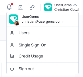
Your credit usage summary
The card at the top gives you the state of your contract at a glance.
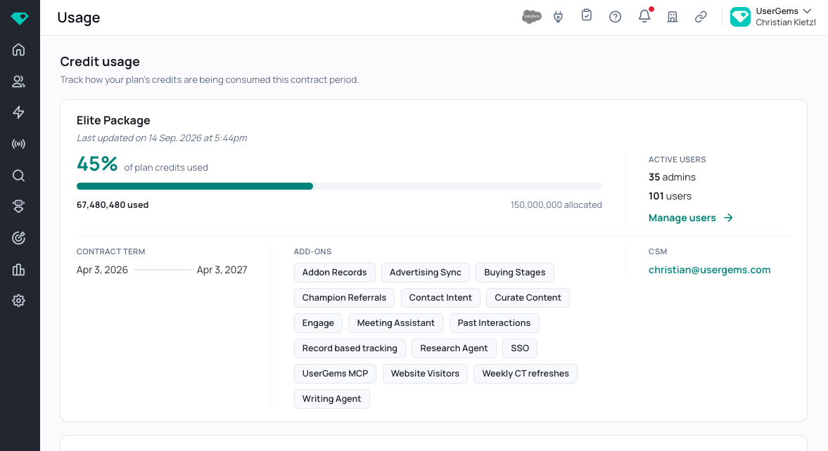
- % of plan credits used — how much of your total allocation you've consumed so far this contract period.
- Used / allocated — the raw credit numbers behind that percentage.
- Contract term — the start and end dates of the period this page covers.
- Add-ons — the add-ons included in your plan.
- Active users — how many admins and users are on your account. Manage users takes you to user administration.
- CSM — your Customer Success Manager's email.
Everything on this page resets with your contract period. The dates under Contract term tell you the window you're looking at.
Credit usage over time
This chart answers one question: at my current pace, where will I end up?
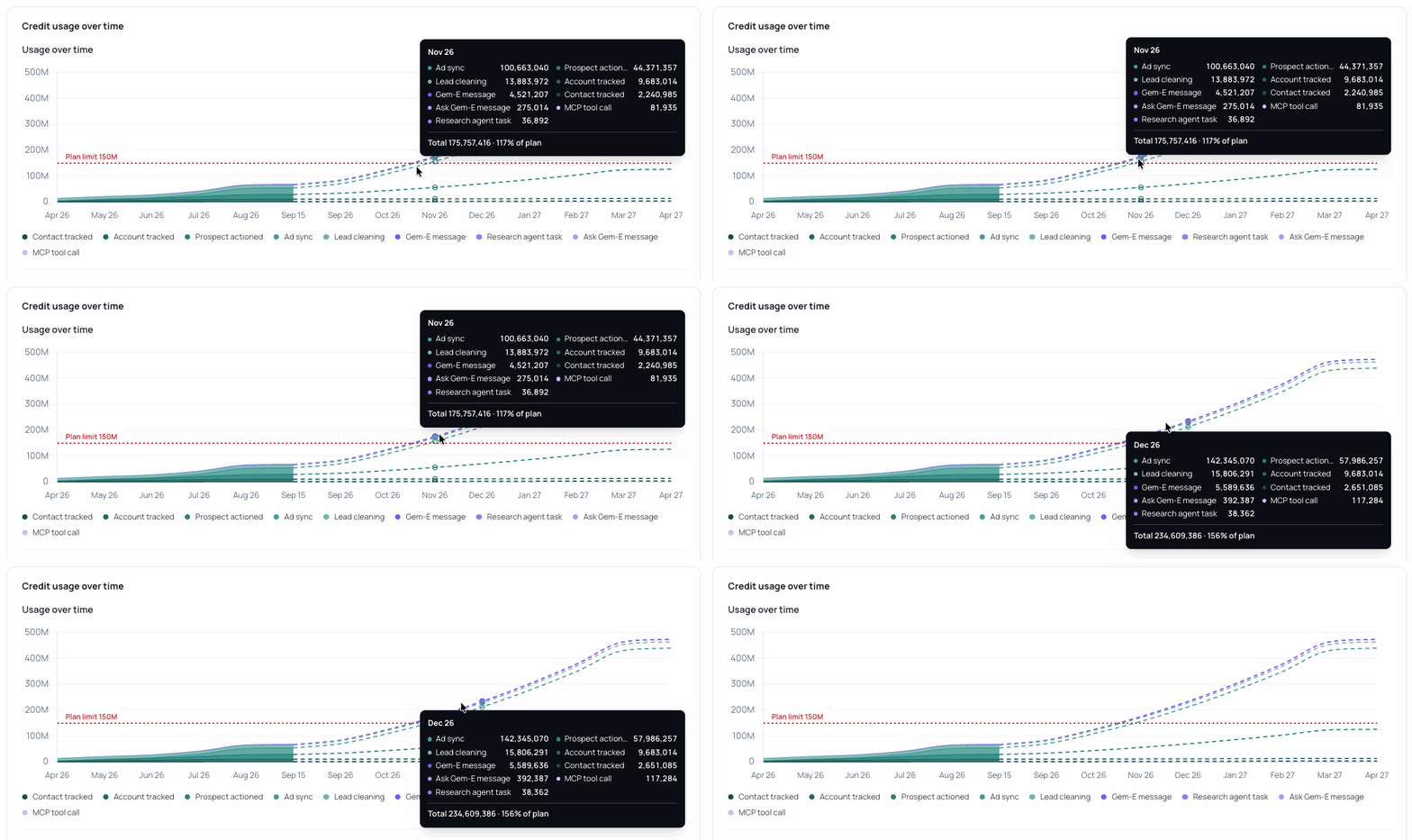
The chart is cumulative. Each month adds to the one before it rather than resetting — that's what lets the line visibly approach and cross your plan limit.
- Solid area — credits you've actually used, up to today.
- Dashed lines — your projected usage for the rest of the contract period.
- Red dotted line — your plan limit.
Hover any month to see exactly what was consumed, broken out by source, with a running total and what percentage of your plan that represents.
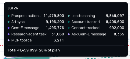
Hover a month in the dashed section to see where you're projected to land — useful for spotting the month you'd cross your limit, and which sources would get you there.
Where your credits went
Two views of the same thing: the bar gives you the shape, the table gives you the detail.
Cumulative to date
A single bar showing how your credits split across activity types, with the total used so far in the heading.
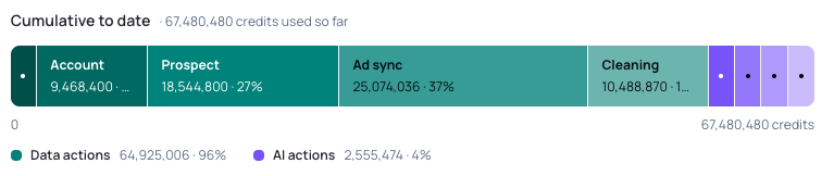
The bar is split into two groups:
- Data actions — tracking, syncing, and cleaning your records.
- AI actions — Gem-E messages, research agent tasks, Ask Gem-E, and MCP tool calls.
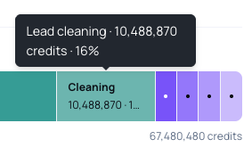
The wider a segment, the larger its share. The narrow segments at the right end are smaller categories — hover any segment to see its name, credit count, and percentage.
By source
Click By source to expand the full breakdown — what each action cost and how often it ran.
- Actions — how many times that action ran.
- Credits — total credits those actions consumed.
- Share — that source's percentage of your total usage, with a bar for quick comparison.
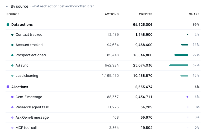
Compare the Actions and Credits columns side by side. A source with a high action count but low credit share is cheap and frequent; one with few actions but a large share is the opposite. That contrast is usually where the useful insight is.
Credits per user
Two panels break usage down by person, so you can see who's active and who isn't.
Ask Gem-E credits per user
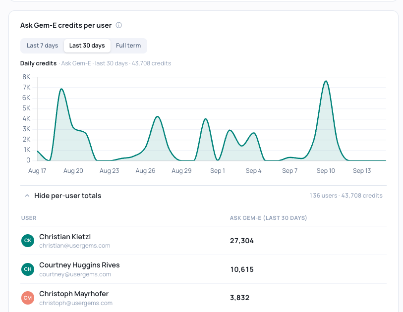
Use the Last 7 days / Last 30 days / Full term toggle to change the window. The chart shows total Ask Gem-E credits over that period.
Click Show per-user totals to expand a list of every user and their credit total for the selected window.
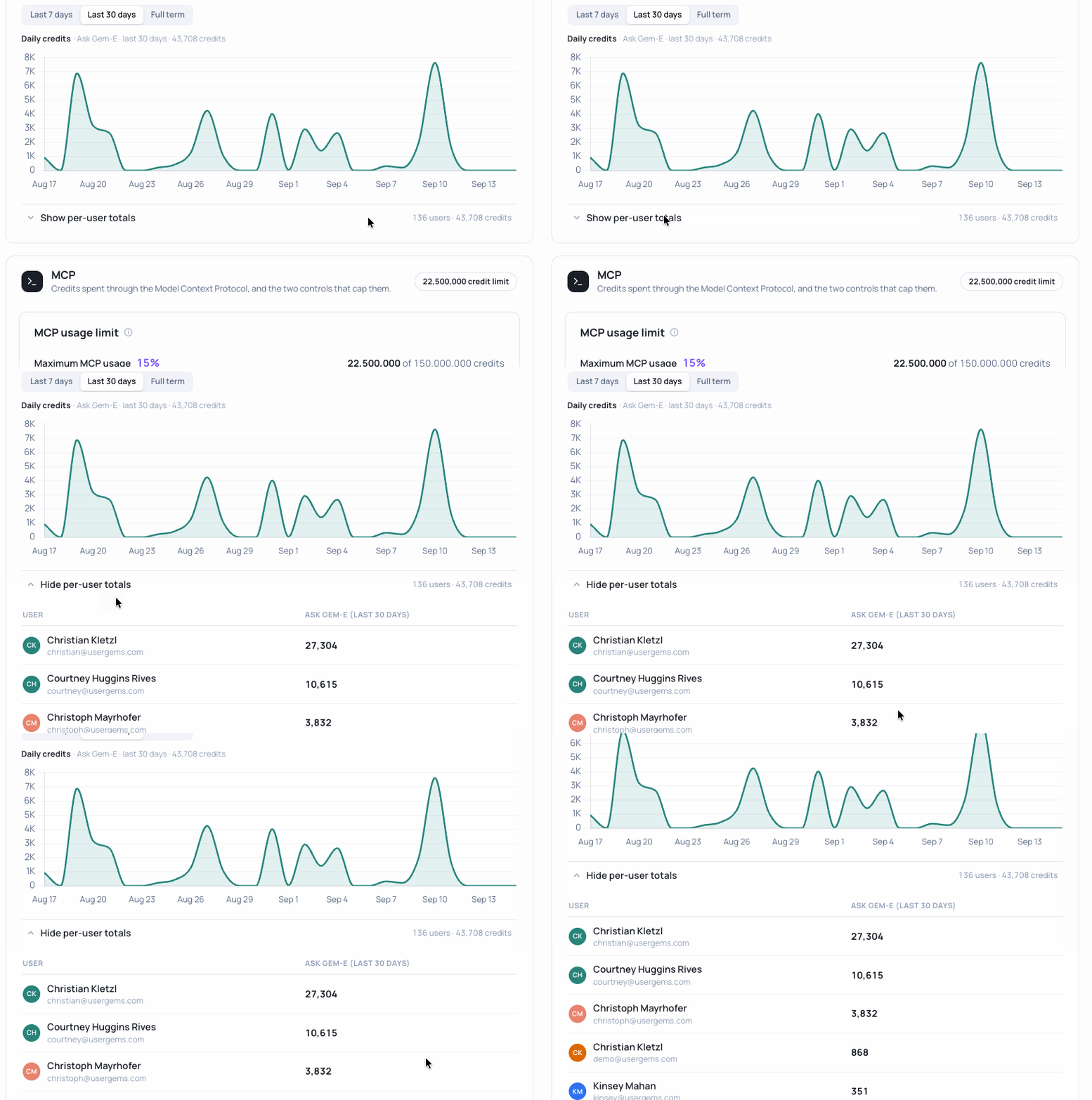
The list is sorted by usage, highest first. That makes it just as useful for spotting users who aren't using Gem-E as those who are — scroll to the bottom to find adoption gaps.
MCP credits per user
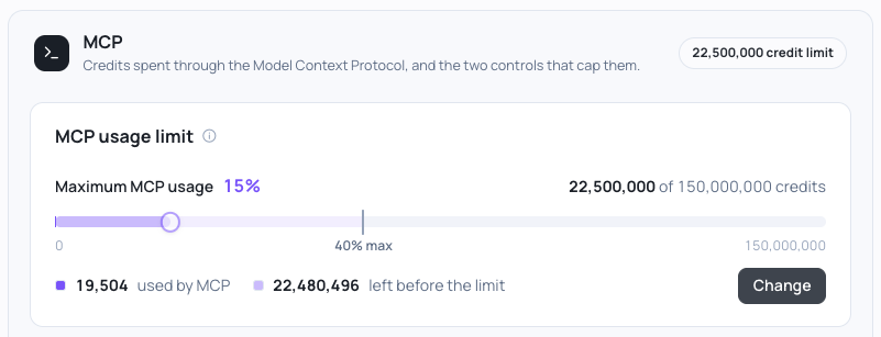
Same toggle, same idea: total MCP credits over the window you select.
For the per-user breakdown, scroll to the user list below the chart. Each row shows that person's MCP usage this week against their limit.
- MCP this week — credits that user has consumed through MCP in the current week.
- Limit — that user's weekly cap.
- % of limit — how close they are to it, with a progress bar.
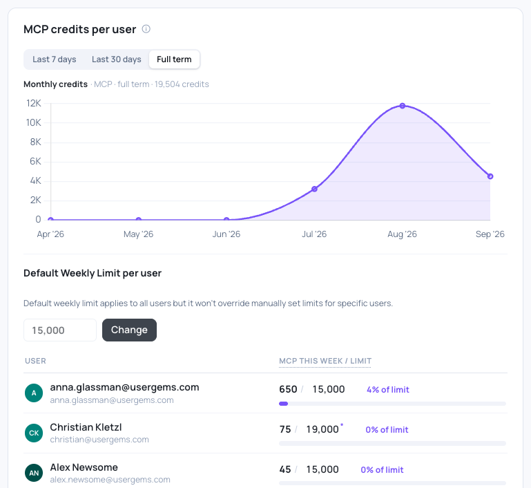
An asterisk (*) next to a limit means that user has a custom limit rather than the account default.
FAQ
Why is my usage line still going up in a month where we barely used UserGems?
The chart is cumulative — each month is added to the running total rather than starting over. A flat stretch means low usage that month; the line only goes down if credits are adjusted.
What's the difference between the solid and dashed parts of the Usage Over Time chart?
Solid is what you've actually used, up to today. Dashed is projected — where you're heading if your usage continues on its current path. Only the solid portion reflects real consumption.
Why don't I see a metric I used to look at on this page?
This page covers activity that consumes credits. Metrics that don't draw on your credit allocation will not appear on this page.
Someone's limit has an asterisk next to it. What does that mean?
They've been given a custom weekly limit instead of the account default.